HF Propagation Map Helps You Visualize HF Propagation
HF Propagation Map Now Available
Many ham radio operators love operating High Frequency (HF). It’s one of the primary reasons many hams upgrade to a General Class license. Now we have a new tool to better visualize propagation prediction and where your signal will be heard — it’s called ‘HF Propagation Map‘ and it was created right here in Minnesota!
You may be familiar with ‘VHF Propagation Map‘ that’s been used by hams around the country for years now to find tropospheric ducting and other workable conditions on 2 meters. That mapping tool uses APRS data to identify band openings. HF Propagation Map was created by the same Minnesota ham behind the ultra-popular VHF Propagation Map. Who is it? Jon Harder, NG0E who is located in Mountain Lake, Minnesota.
What data is being used to create the hf propagation map?
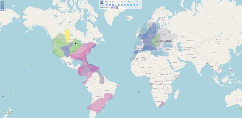
HF Propagation Map pulls from a variety of online data sources to generate the map. The sources include: WSPRnet, Reverse Beacon Network (CW, FT4, FT8), PskReporter, and DX Cluster. Some of these data sources provide signal-to-noise ratio (SNR) information which gives the ability to predict propagation for voice, CW, and other digital modes. The map indicates SNR levels with three different per-band shades:
The map display shows worldwide activity from the last 15 minutes and is automatically updated every minute.
What else can the map tell me?
The mapping tool provides Maximum Usable Frequency (MUF) data. The MUF is the highest frequency that supports communication between two points. On this map, MUF can be considered the maximum used frequency since the display is based on real-time data.